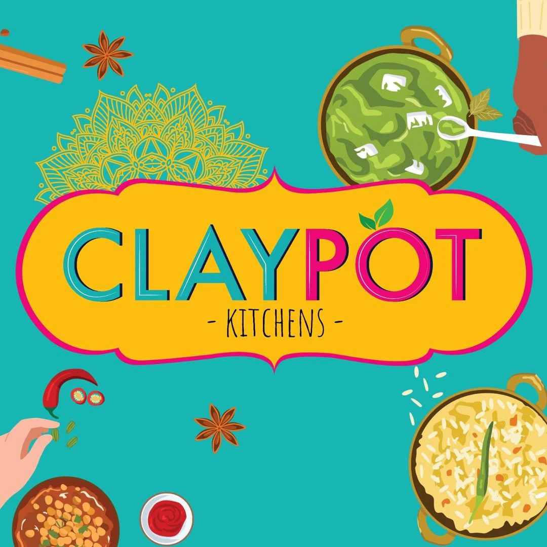
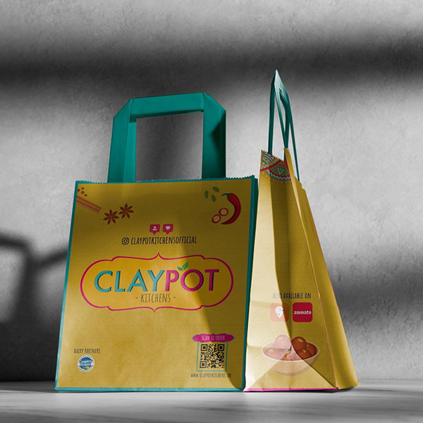
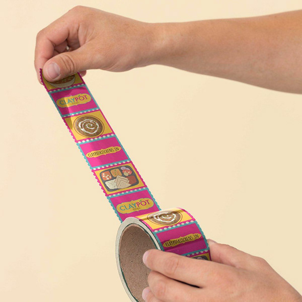
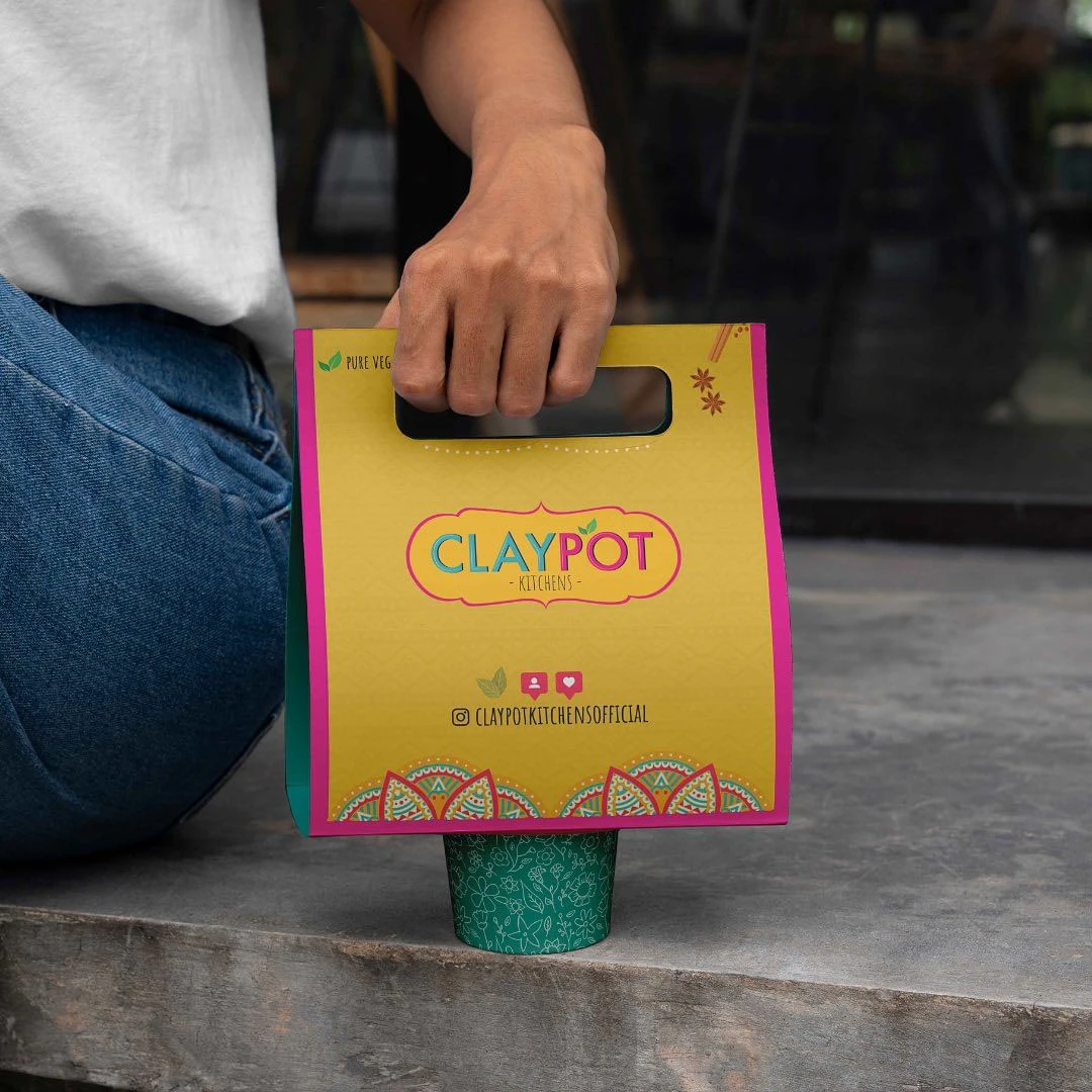
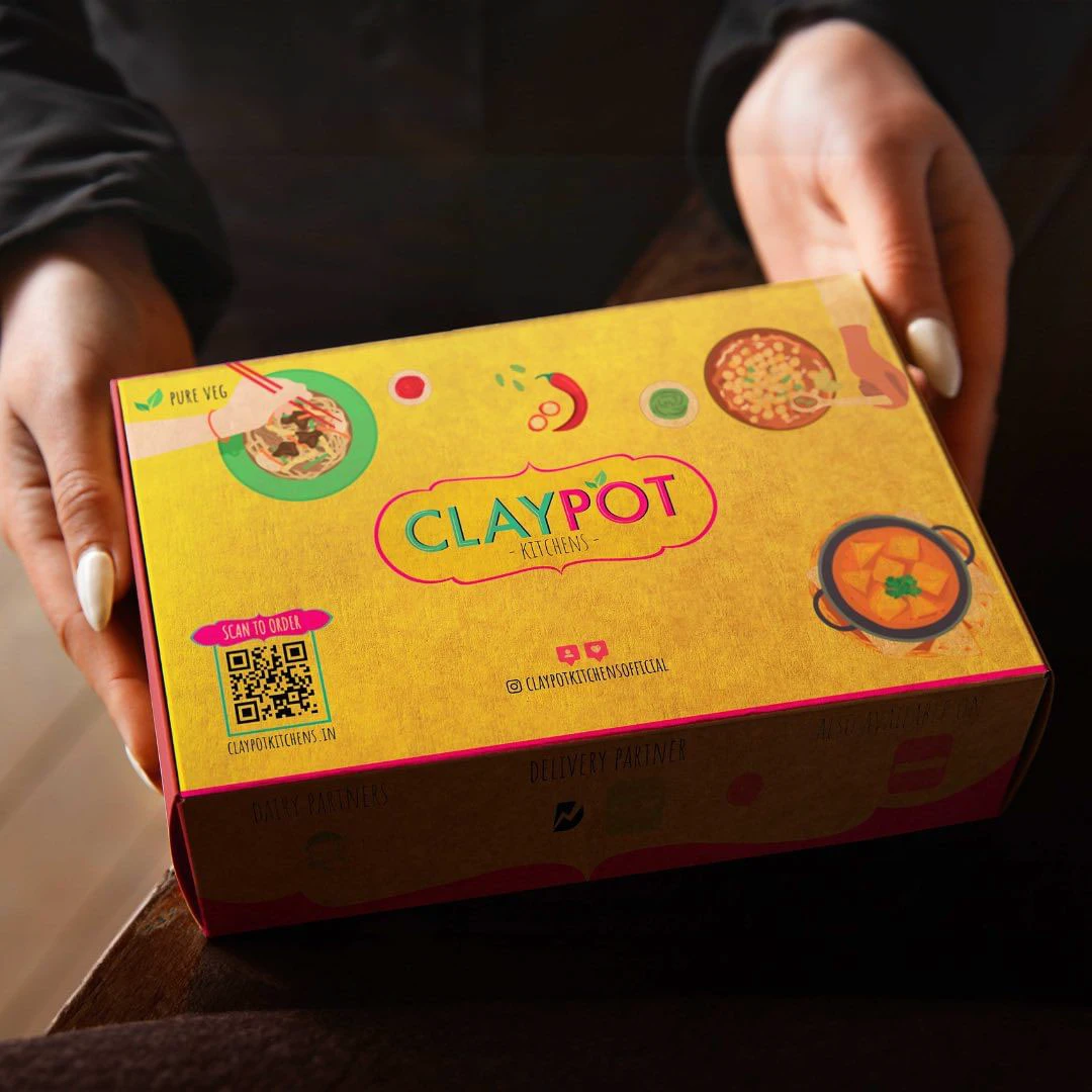
The vibrant Branding and Packaging for Claypot Kitchens
Designed for: Claypot Kitchens
The Brief: An existing Kitchen offering Take Away on major aggregators and specialising in Indian Cuisine wanted an upgrade in their branding.
Our Vision: We wanted to give a touch of quirkiness and vibrance to the brand. The colour palette curated some bright tones of colours that make one feel happy. This was followed by all other major collaterals that were careful visualised and curated with the right typography, mandala art and other elements in place.